Top 7 Box Art Styles This Generation
Irrational Games lit quite a spark when it revealed the official box art for BioShock Infinite back in December. The cover was rightfully maligned for boiling a beautiful, unique, and multi-layered adventure down to a generic shot of the protagonist holding a gun in a passive-aggressive stance. The prevalence of this uninspired box art tactic has been studied elsewhere, and it will not be mentioned here other than to say it’s lazy and generally disingenuous to the games’ creative identity. It might seem nit-picky to some, but I want the face of a game to give me an instant snapshot of what its all about, presented in a manner that is visually striking. With games becoming represented by digital box art in increasingly art-heavy user interfaces, that little slip of paper that once faced the dark side of the cupboard has become more important than ever. Poorly-targeted focus groups be damned; here are the best box art styles from this console generation.
[ProTip: Click the images to inspect higher-res versions]
NEGATIVE WHITE SPACE
 First popularized (and absolutely nailed) by Criterion’s Burnout: Paradise, the negative white space tactic has proliferated throughout much of the industry. Why? It’s visually striking with an immediacy that is lost among “busier” artwork. Often an iconic silhouette is printed in stark contrast to the plain white background, while colorful composites fill the interior for a layer of depth. This style is also applied across a number of EA games, perhaps most successfully (other than the aforementioned Paradise) in Dragon Age: Origins and The Godfather II. Negative white space was also used to emphasized the effect of paint for Epic Mickey, and was even applied most recently in Aliens: Colonial Marines, proving that good box art does not have to be held back by the quality of the game it represents. Also notable is Resistance 3, which essentially employs the polar opposite of the negative white space tactic by using white as the formative silhouette of the chimera skull with red as the “negative” background, each containing shapes that bleed into each other with further information about the title.
SIMPLICITY SPEAKS VOLUMES
 Negative white space is so striking in part because in invokes so much within a relatively simplistic space. Some games, however, take that idea of simplicity and escalate it to new levels. Often repeated is that saying that a picture is worth a thousand words, and that is true of even the most simple, provocative imagery if it is composed correctly. One of my favorite examples of this tactic is the original Dead Space, which features a solitary forearm floating amongst the backdrop of space. There is essentially only one object in this image, yet its bloody, decaying state and the cosmic background communicate the game’s central themes (along with its name, of course) while the fact that the forearm is severed even hints at the central gameplay mechanic. The last two Elder Scrolls games, Oblivion and Skyrim, mirror each other with a prominent subtitle, a single iconic rune, and the general aesthetic of an ancient tome, hinting at the epic, self-told stories found within. Other notable examples utilizing a simple-yet-powerful motif are the rain-battered origami crane for Heavy Rain (but only in Europe…the US got this abomination instead), the foreboding one-shot of Limbo, and the no-nonsense imagery for skate.
CREATIVE COMPOSITES
 Although most of the negative white space stalwarts could also fit into this category because of their heavy use of composite (i.e. melded together) imagery, the examples I wanted to highlight here are fundamentally different. While the white negative serves as a powerful, intrinsic part of the aforementioned artwork, some games don’t bother with clearing out space and instead simply use combinations of existing imagery to work closely together. Perhaps the most popular example of this tactic comes from Gearbox’s Borderlands, and of course the essentially identical art in its sequel. At first glance the box simply contains a single character like any other, but the “finger gun” to the head, along with the exploding artwork popping out of the other side, inform the consumer instantly about the whimsical, over-the-top nature of the game, while also hinting at some of the secondary mechanics and wrapping it all in the game’s distinct visual style. But it’s not always fun and games, as evidenced by F.E.A.R. 2: Project Origin‘s forboding box, which casts an otherwise generic protagonist within the shadowy silhouette of the haunting Alma, complete with a shroud of mystery and the chaos she embodies.
THE CLASSIC GRAND ADVENTURE
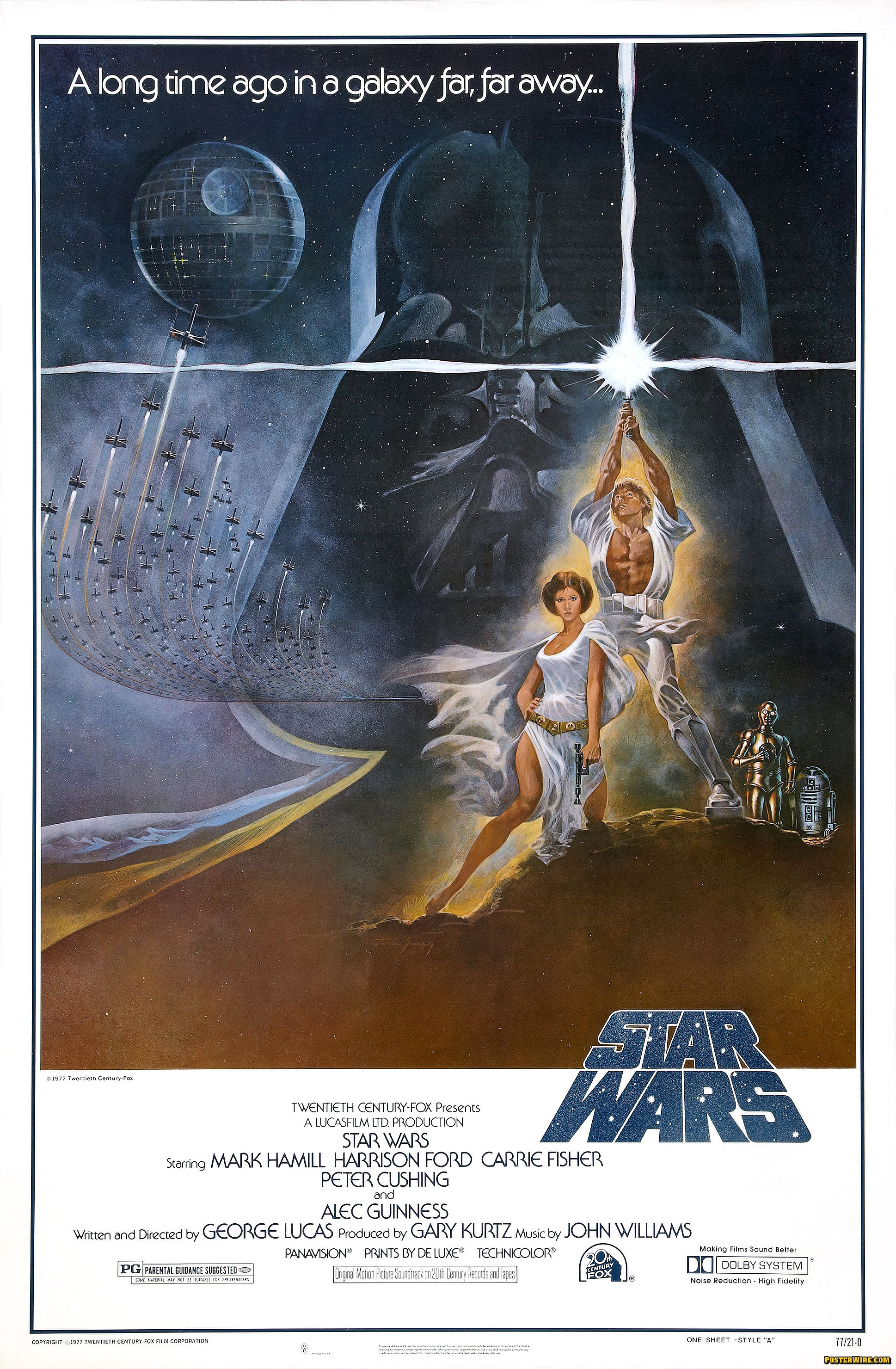
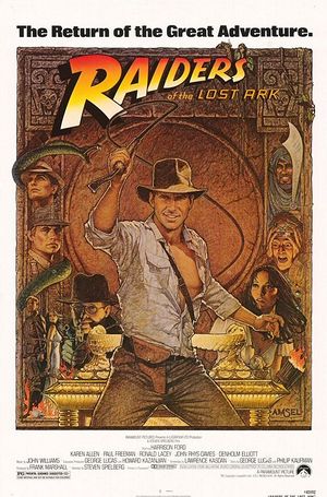
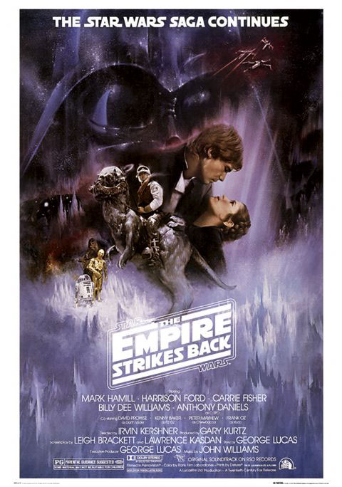
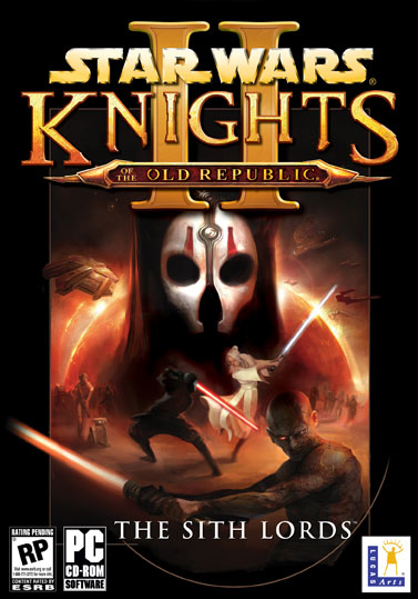
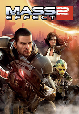
 My personal favorite style of box art, it is inspired by the epic tales of yore. While the style’s origins are surely rooted even further back in history, it is known and beloved to me because of such film posters as Star Wars, Indiana Jones, and of course their associated sequels/prequels. In gaming, despite the prevalence of grand adventures with diverse casts and colorful worlds, this style of all-encompassing artwork is rarely employed. Unsurprisingly, one of the remaining torchbearers is Lucas’s own Star Wars: The Old Republic, keeping tradition with its Knights predecessors on top of the iconic films. The only other modern example I could dig up is the original Mass Effect‘s box art, itself a game inspired by the Star Wars epics (in case you didn’t know, BioWare set out to make Mass Effect after their success with the original KOTOR, and it is in many ways a spiritual successor). These poster-like images literally tell you all there is to know, with snapshots of several key figures, objects, and locations, all laid out in a way that is visually appealing and communicates the far-reaching epicness of the adventure within. If only Mass Effect continued this legacy rather than reverting to the EA-ified generic covers that adorn its sequels.
THE SEGMENTED COLLAGE
 Another style that could easily encompass several other games mentioned above, the particular type of collage I am referring to does not layer images among or within each other, but rather combines them side-by-side to collectively form a whole. Perhaps the most famous purveyor of this technique is Rockstar’s Grand Theft Auto series, which has been employing the style since the series’ began its modern incarnation on the PS2 and continues on in Grand Theft Auto IV and, presumably, the upcoming GTA V. Ubisoft also employed this style of collage on the North American boxes of Far Cry 2.  Like the epic canvasses of the sci-fi masterpieces mentioned above, these segmented collages offer glimpses of several facets of the worlds they represent, but instead of layered together are split into slightly more contextual, self-contained panes.
ENSEMBLES DONE RIGHT
 One of the many culprits of the generic box art is that which simply throws a bunch of characters into generic, passive-aggressive poses under the title logo instead of the more typical solo figure. These types of boxes are no more inspiring because of an increased headcount, but there are some examples among them that add just enough detail and flair to be interesting rather than derivative. Case in point: the box art for the retail version of Telltale’s The Walking Dead. Central characters Lee and Clementine are depicted with a nod to their unique relationship, but in the foreground lurks the eponymous walker. NetherRealms’ Mortal Kombat reboot doesn’t overburden itself trying to squeeze the entire roster onto its cover, but instead frames an epic battle between its two most iconic fighters performing their most iconic moves. In an visually interesting twist, Mortal Kombat‘s artwork has a sense of depth to it instead of simply operating on a generic flat plane, while the iconic dragon logo lurks in the background. Other examples that utilize protagonists in visually interesting, tonally-reflective ways are the boxes for Portal 2, Gears of War 3, and Naught Dog’s upcoming The Last of Us.
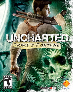
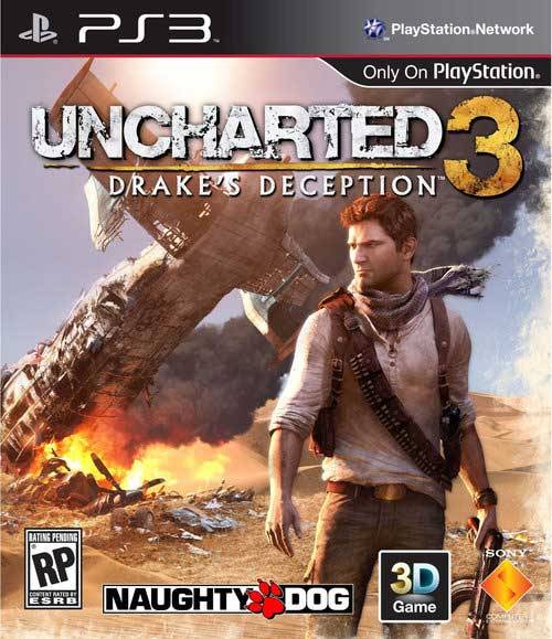
STYLISHLY SOLO
 Sometimes it just makes sense for one character to be the iconic figure that symbolizes the entire game. Sometimes that character is so symbolic, so central to everything the game is about, that to not feature them on the cover would borderline on misinformative. However, just because it makes sense to feature a single character doesn’t mean the artists have license to get lazy and spit out the same thing we see over and over and over. The game stands out from the pack, so its box should stand out, too. There have been numerous examples of this style of box art this generation, despite the overwhelming tendency to fall in line. Two of the most recent examples are Tomb Raider and Metal Gear Rising: Revengeance. The former prominently features heroine Lara Croft, but her body language suggests this Lara is vastly different from the classic iteration of the character; she’s beat up, she’s young, she’s vulnerable, she’s cold and scared yet with determination in her eyes (and, notably, she is proportioned like a real human being). These facets all exemplify what defines this fresh imagining of the character, while every piece of the background (the crashing waves, the wrecked ship, the pounding rain, and the dark cave) all speak volumes about the setting. Metal Gear Rising, meanwhile, shows protagonist Raiden in-action performing one of his signature slice moves, rather than just standing there looking emo. These characteristics all boil down to the central themes that make good box art interesting–visually striking and instantly informative about the product–despite their focus on a single character. Some other notable examples: Uncharted 2: Among Thieves‘ box showing Drake hanging on for dear life (rather than his nonchalant stances in Drake’s Fortune and Drake’s Deception); Batman: Arkham City‘s monochromatic, perched Dark Knight featuring a Schindler’s List-esque red highlight on the blood on his first; and the upcoming Luigi’s Mansion: Dark Moon, which shows the cowardly title character nervously creeping around the corner of the box itself.


nice article, loved the descriptions